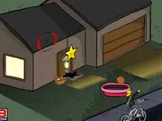
Spot the Unique Halloween
2,434 spilletider
Spilldetaljer
Hva handler Spot the Unique Halloween om?
The @media rule is a powerful tool to create responsive designs. It enables you to apply different styles to your pages depending on a variety of media features, such as screen width, device orientation, and resolution. Here's a basic example:
css

@media screen and (max-width: 600px) {

  body {

    background-color: lightblue;

  }

}
This code snippet changes the background-color of the body to lightblue when the screen width is 600 pixels or less. You can add as many @media rules as you need to cover various screen sizes and device types.
Another approach to dynamically apply styles is by using JavaScript to add or remove classes based on certain conditions. For instance, you might want to add a .dark-mode class to the body element if the user prefers a dark theme.
javascript

const userPrefersDark = window.matchMedia && window.matchMedia('(prefers-color-scheme: dark)').matches;

if (userPrefersDark) {

  document.body.classList.add('dark-mode');

}
In this JavaScript code, window.matchMedia('(prefers-color-scheme: dark)') checks if the user's system prefers a dark color scheme. If it does, the dark-mode class is added to the body, allowing you to define specific styles for dark mode in your CSS:
css

body.dark-mode {

  background-color: #333;

  color: #eee;

}
For more complex dynamic styling, CSS variables (also known as custom properties) can be incredibly useful. They allow you to define variables in CSS and reuse them throughout your stylesheet. You can also update these variables with JavaScript, effectively changing multiple styles at once.
css

:root {

  --primary-color: blue;

  --font-size: 16px;

}

button {

  background-color: var(--primary-color);

  font-size: var(--font-size);

}
And to change them with JavaScript:
javascript

document.documentElement.style.setProperty('--primary-color', 'red');

document.documentElement.style.setProperty('--font-size', '18px');
This snippet changes the primary color to red and the font size to 18px for all elements that use these CSS variables. This method provides a centralized way to manage your design tokens and allows for easy theming and dynamic updates.
By combining @media queries, JavaScript class manipulation, and CSS variables, you can create highly flexible and responsive stylesheets that adapt to various user preferences and device conditions.
Can we play Spot the Unique Halloween on mobile?
Yes, Spot the Unique Halloween can be played on mobile devices as well as on desktop computers. It runs directly in the browser and does not require any downloads.
no
no
Kan vi spille Spot the Unique Halloween i fullskjermmodus?
Yes, Spot the Unique Halloween can be played in full screen mode for a more immersive experience.
Hvilke spill kan vi prøve neste gang?
Utforsk vår Berøringsskjerm-seksjon og oppdag populære titler som Knockem All, Rescue Helicopter, Halloween Tetris og Bubble Shooter Butterfly - alle tilgjengelige for å spille umiddelbart på Y8 Games.
Kommentarer
Relaterte spill
-

Nightmares: The Adventures 1 - Broken Bone's Complaint
-
Nightmares: The Adventures 2 - Who Wants To Frame Hairy De Bully?
-
Pimp My Zombie
-
Devilish Trick
-
Click-o-Trickz!
-
Good Witch Makeover
-
Tripeaks Halloween
-
Draculi
-
Baby Hazel Halloween Party
-
Haunted Halloween
-
Dracula's Dentist
-
Emily's Diary: Birthday Party
-
Pumpkin Smasher
-
Mini Golf Halloween
-
Newspaper Boy Halloween
-
Halloween Run
-
Halloween Spooky Pancakes
-
Halloween Endless Slicer